How to approach application design in an efficient way?

In the previous article we have mapped the business process for our application. Today I would like to take a moment to talk about design. I believe that we should have this covered before jumping into implementation.
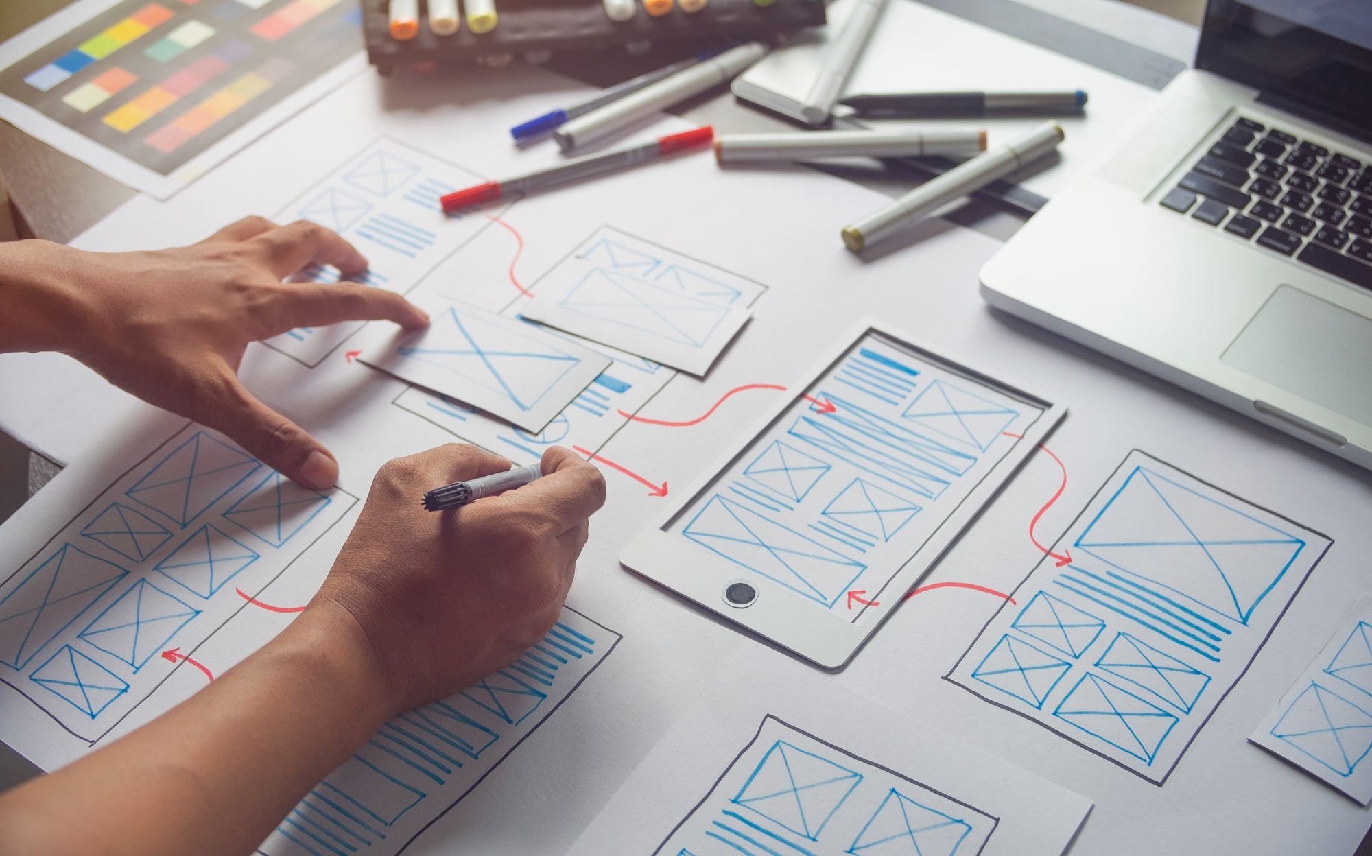
First of all design and coding are quite different phases and require different mindset. I would claim that the design allows for (and requires) experimentation, quick drafts and hypothesis verification, detached from the technological choices. It is not that easy when you already started thinking about reusing existing components. Imagine designing an on-boarding flow, while having form fields & forms implemented in another place. I bet there will be a strong sentiment to reuse existing components, refactor and make them customizable, or at least new forms will be an evolution of existing ones. It’s like trying to run with both legs tied up. That is why there is benefit in splitting those phases, especially if the same person is responsible for the look & feel and the actual delivery.
Secondly with a few hours of work invested in design we can get a picture (now the whole picture) of full application flow. If the same amount of work is invested in coding we can get an ugly 1-2 pages. I am saying ugly, because I know from experience that when I started coding without design, I was more focused on the code reusability, or what can I easily get with a framework then making it look nice and coherent. Starting with the code always turned out to be sub-optimal.
A picture is worth more than a thousand words. App design can be shown to the customers, investors or developers. It is easier for customers to understand what we are trying to solve if they actually see it and provide feedback that can be implemented cheaper. From investors perspective it is similar, although it has other benefits as well. A deck with the flow is more professional and increases the founder’s odds. It does not mean that the design cannot change though. Lastly a founder might decide to use help to implement the app. Designs are a perfect Acceptance Criteria for the team, or 3rd party vendors.
Finally it is way easier, quicker and cheaper to change the design than change the code
Design efficiency
I am not a professional designer, I am an engineer who implemented designs and played with Figma for a bit. There are plenty of materials on how to design better and more beautiful flows, I am not going to step out of my expertise here. I will stick to some practical, down to earth implications of the design process.
Mobile first
Let’s start with the fact that the majority of the web traffic comes from mobile, not desktop. This means it is more important to focus on the design for mobile devices than desktop. This approach is called mobile first. However we are talking about web applications designed to look and work well on mobile browsers, not mobile applications bought via App Store or Google Store.
I have witnessed a situation where a founder decided to focus on desktop first, because “the statistics didn’t apply to the problem they were trying to solve”. He was smart enough to verify that by using Google Analytics features that strongly supported the opposite claim and changed direction.
Looking at the problem from a different perspective, it is easier and cheaper to start with a mobile version and make it desktop compatible than the other way around.
The mobile first approach also forces designers to keep things simple, while it is easy to get carried away if there is a whole desktop display size to use.
Design system
A design can be very custom and fancy. The more custom and pixel perfect it is, the more difficult, time taking and costly the implementation will be. The worst thing is that we can invest a lot in this process and still get sub-optimal results for some mobile, or desktop screen sizes. There is a small number of variations for Apple devices, but Android is a different story and desktop can get resized on demand. The problem was addressed with the rise of the design systems. For example Material by Google provides specific rules, guidelines and most important predefined components that can be used for free. There are others like Apple Human Interface, or Microsoft Fluent. Design systems are good for the team, as it is easier to find talent, transfer knowledge and find resources. They are also good for customers, if the app follows some guidelines implemented in another app they use, it is going to be easier to get familiarized with the new app. The most popular design systems are also battle tested and constantly improved.
It is important to decide on a design system before starting the work on design, especially if it is done by an external company. This way we optimize the time and effort and avoid surprises.
The 80-20 rule
The 80-20 rule means that 20% of the effort is required to do the initial 80% of the work, while the remaining 20% of the work takes the 80% of the time. From the design perspective it means building a pixel perfect design, that at the end of the day does not even look great on every device size. This has to be remembered especially if it is done internally. A design is a rabbit hole, as there will always be an incentive to do the most beautiful, most user friendly app.
The other aspect of this rule is that sometimes a design implemented in 80% takes 20% of the time, while it can take ages to do the final touches.
This sounds like I am suggesting serving half cooked meals, because it takes too long to cook the meal properly. I am not. I just highlight the risk of getting diminishing results with more time & money invested. There is a concept of “good enough” and having scarce resources founders should remember about it. The most beautiful app is worth nothing, if there are no users to use it.
Browser/Device support
Approaching the design for the first time, there might be an assumption that it is a finite, one time job. The reality is that we do not have a direct control on how the UI is being rendered on our user’s device, as there is a big number of screen sizes and browser variations. That is why there is a need to scope out the design (displays) and implementation(browsers), to match the resources at hand. I would suggest selecting at least one display size for each category: phone, tablet and desktop and define the supported browsers and their versions.
Resources and Intellectual Property
We have to have the right to use any resource like pictures, illustrations, logos, icons and audios used in our landing pages and applications. We can make materials on our own, buy them or use the free ones. I encourage you to explore the third option, especially in the case of scarce resources.
First tool that I want to share is coolors.co it is a color palette generator. These colors look good together and can be a nice base for your application.
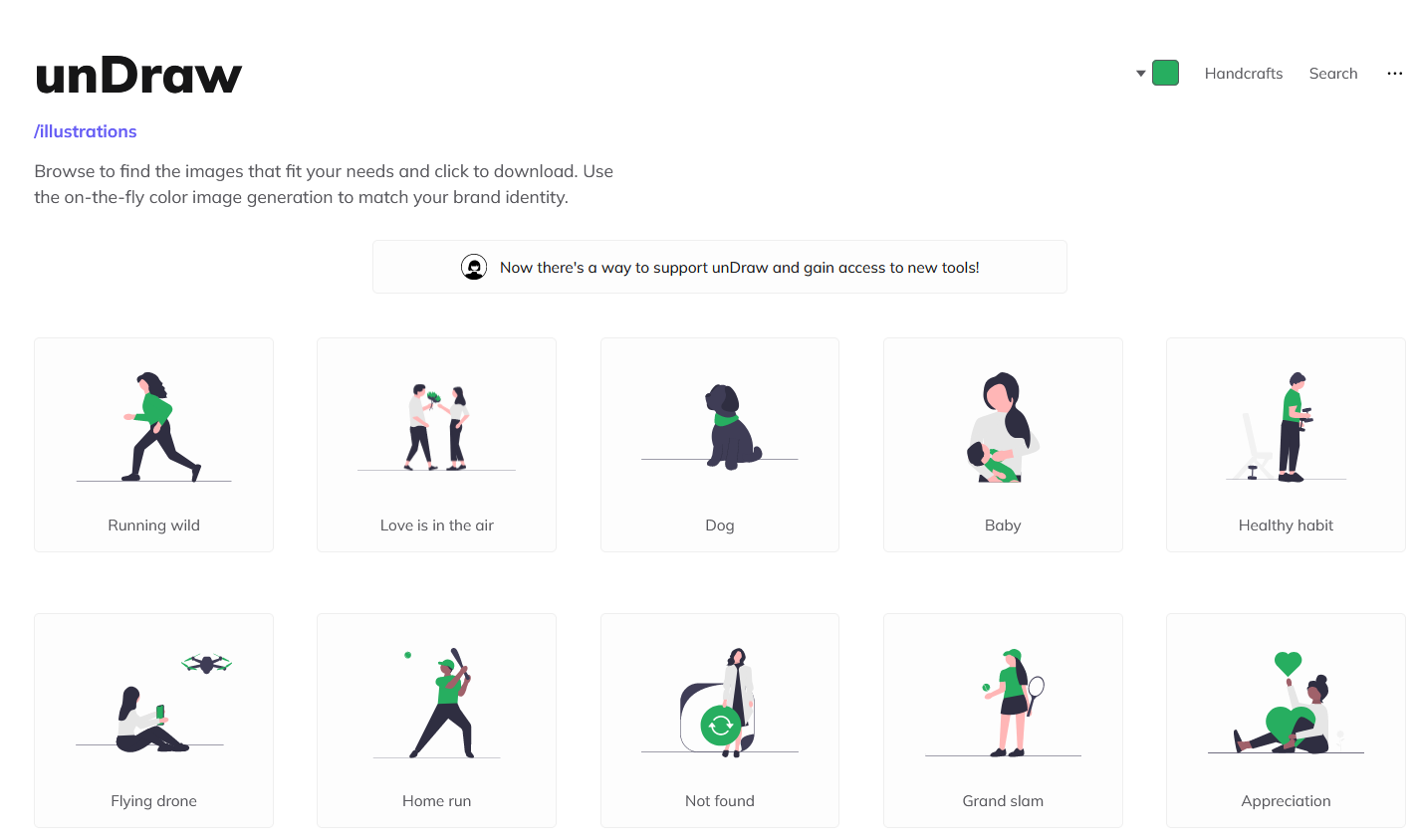
Secondly there are free illustrations that can light up the application and make it more professional like undraw.co, with a free license for commercial use. There is also an option to use the brand colors to make it feel like home

These are just some examples to show that there is no need to start with expensive agencies. A nice design can be also achieved with investing no money
Customer feedback
As always I highly recommend getting feedback as soon as possible. Some design tools like Figma allow us to wire the design up so we can get a feeling of the application flow before typing a single line of code. Share it with friends and customers and iterate.
Versioning
Before passing a design, or a single page to the development it is important to close the design phase, at least for the page at hand. Changes in design can cause disproportional change in the work required to implement them, spoil the estimates and make developers hate the designer. Imagine a house renovation project. The building crew got a blueprint, they followed it well and are at the stage when they wait for the paint to dry. An architect comes with the requirement to break one wall. The project will at least have to wait till the paint dries, so the dust does not settle on it. But let’s imagine hammers and broken bricks falling on the new floor…
The way to address this problem is to introduce versioning. The development force receives requirements not only with a page, but also the page version. The designers can work on newer versions without breaking the development flow and developers do not suffer from a scope creep. Yeap! Moving the button 5 pixels to the right, or changing the button color 3 times to see how it looks, is a scope creep if the development has started. The change can be addressed in the next sprint, or next project, but not during the development.
There is one more benefit to specifying the version and avoiding the scope creep. As the work has the scope finite, when it is done we have a working version . It might not be the perfect one, not the freshest state of the design, but something. The development can move on to other pages and not get stuck on the login page, or on-boarding. This means that we can show our application to users.
Summary
In this article we covered a few topics related to efficient design from the perspective of product delivery. Usually I try to cover theory and practice in a single article, but since this one got quite big I decided to move practice to the next one. It will cover a sample design work and my thought process for the plant app.
If you are new to my blog, this is a series where I am going to build an MVP for an imaginary startup, explaining different stages of development step by step. I you liked this article I encourage you to subscribe to my blog or follow me on LinkedIn
References
- https://gs.statcounter.com/platform-market-share/desktop-mobile-tablet
- https://xd.adobe.com/ideas/process/ui-design/what-is-mobile-first-design/
- https://designerup.co/blog/10-best-design-systems-and-how-to-learn-and-steal-from-them/
- Alternatives to Material https://www.g2.com/products/material-ui/competitors/alternatives
- https://undraw.co/illustrations
